 Scroll through the whole page to download all images before printing.
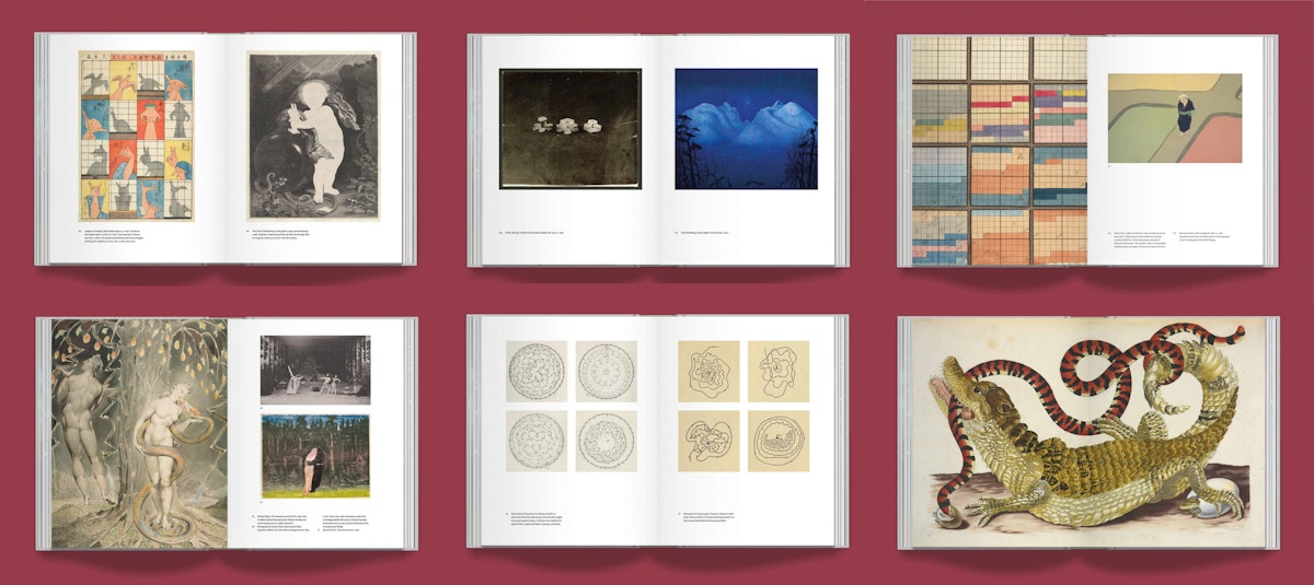
As the crowdfunder for our landmark book of images Affinities — now more than 220% funded — enters its final few days, the editor Adam Green answers a few questions, offering a sneak peek at the book's inner workings.
UPDATE: The crowdfunder is now over, but you can still buy the standard edition of the book on presale over on Volume here.
***
The book consists of one single sequence of more than 500 public domain images — all arranged, as you put it, “according to a dream-like logic, through a play of visual echoes and evolving thematic threads”. It sounds like a mammoth task to coordinate and put together. How on earth do you even get started on a project like this?
It's been bubbling away as an idea for a long time now, perhaps as far back as the birth of PDR back in 2011. Ten years of online trawling has spawned hundreds of image folders — on various themes and associative categories, connections, affinities — which have been the genesis of lots of PDR content, but there's also lots of things yet to make their way onto the site. And then this idea to do a big image book for the 10th anniversary came about, and suddenly I have a home for them which is super exciting!
In terms of actually beginning to put the pages together, I suppose the starting point was knowing there were certain images I really needed to include — favourites I’ve grown very attached to after a decade of deep public domain immersion — and then really building out from there, into specific pairings, clusters, and sequences. This bit was really fun, in a way letting the images themselves demand the next move. Then came quite a challenging stage where I had to find a way of arranging these disparate sections into one long sequence, keeping in mind a certain arc of the whole. There’s obviously a million different ways it can go, and I had to kill a lot of darlings along the way — which I don’t find very easy! Once the overall sense of an order was in place I’d be finessing the flow and sometimes needing to actively hunt for certain kinds of images to make the sequence work. It was often a real challenge but the kind of work I love, embarking on long and winding skirmish raids into online repositories with a very specific brief, e.g. to find an image of ritualistic objects parcelled out on a surface, or an agricultural image containing serpentine forms.
And that’s just the image sequencing side of things. There’s then an immense amount of hours gone into research for the captions, sourcing, bibliography, notes, etc. It’s pretty much completely taken over this last year and more!
How does it begin? How does it end?
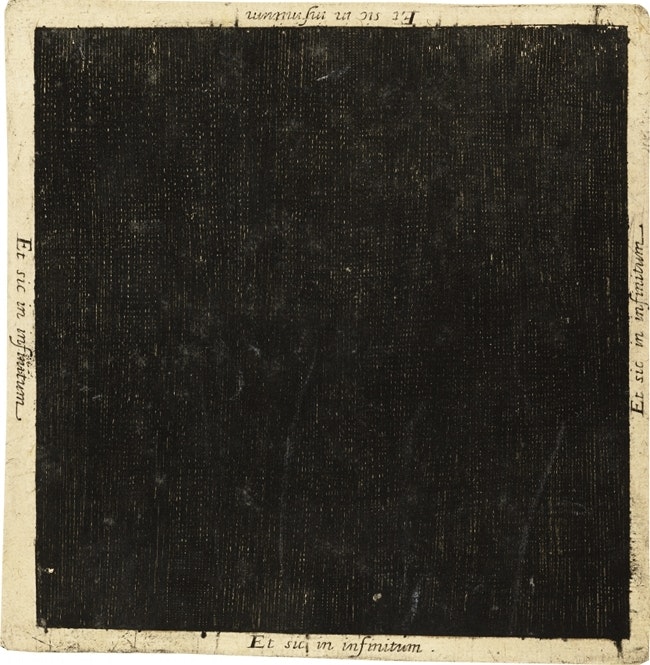
The book begins, appropriately, with an image of the beginning, or rather just before the beginning, Robert Fludd’s remarkable depiction of the nothingness before the creation of the universe, from his Utriusque cosmi ... historia (1617). It’s a very unusual image, just a black square (though slightly textured), and on each edge inscribed "Et sic in infinitum" (And so on to infinity).
 Scroll through the whole page to download all images before printing.
Robert Fludd's black square representing the nothingness that was prior to the universe — Source: Wellcome Library.
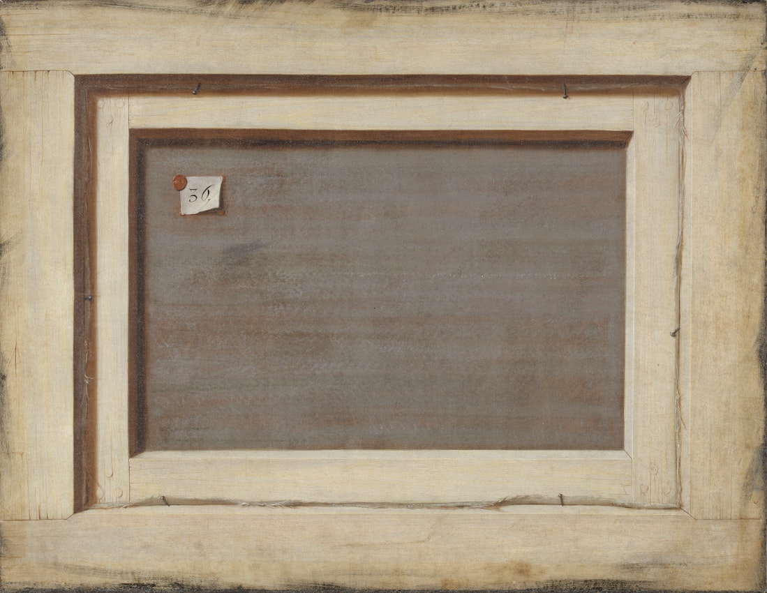
By the end — after a meandering course through holes, ghosts, oceans, music, moons, dreams and much more in between — we arrive at some sense of a finale, the great sweep of history, time, and then ruins, and from this a sort of rebirth through art. The final image is Cornelis Norbertus Gijsbrechts’s The Reverse of a Framed Painting (ca. 1670), a trompe l’oeil of a canvas back. It’s got a sense of abstraction, and of being the back side of creation, as it were, which loops us back round to the first image of Fludd’s abstract nothingness prior to creation. The idea is that there’s no end to the sequence as such, just a cycling back round to the beginning again. This is part of a wider attempt to break apart the linearity implied by a book format — there’s also “alternative trails” marked out, where images point to other images outside of the left-to-right progression of the main sequence. The vision is for a kind of rhizomatic network of associative paths one can wander down, a book that you can jump into at any point and then jump out perhaps many pages behind. The reader might even find and mark out their own trails.
 Scroll through the whole page to download all images before printing.
Cornelis Norbertus Gijsbrechts, The Reverse of a Framed Painting (ca. 1670) — Source
What kinds of affinities are explored? Tell us about a few of your favourite spreads?
So the images are brought together (across a spread and between spreads) through various means — sometimes purely visual, sometimes thematic, and often a mix of both is somehow at play. Here’s an example where it’s something purely visual that was the starting point. On the left is a 19th-century diagram showing white light splitting into colours through a prism, and on the right one of the many beautiful maps made by a 16th-century Ottoman Admiral named Piri Reis (this one is of Alanya in Turkey). There’s a resonance between the undulating shapes of the colour waves (left) and mountains (right), and these vertical strips of colour too, as well as this radiation from a focal point, the prism (left) and the compass rose (right). So we’ve got this lovely formal affinity, but these two images are also united by the themes which unfold around them. The pairing acts as a kind of hinge from a section on colour charts to mountains/volcanoes, but this sense of light and colour is retained in the mountain images that follow, and it all eventually resolves into optical effects produced by volcanic plumes, and then on into a section of nightfall and dreams.
.jpg?fit=max&w=1200&h=850) Scroll through the whole page to download all images before printing.
Scroll through the whole page to download all images before printing.Here’s another pairing which shows how the affinities often work on a textual level as well as visual. On the left is a marbled endpaper, on the right a tattooed man (with excellent centre-parting). Before anything is known about the images, they seem to just really work together — something about the colours and the sepia, and the juxtaposition of these very different visual fields. And there’s, of course, something immediately resonant in the double presence of ink here, in the marbling and the tattoos. But then a glance at the captions reveals further resonance. We learn the man is a German stowaway photographed on Ellis island before being deported, a fact which brings the sea-like pattern of the endpaper to the fore (already in place, in fact, as the preceding spread is of Japanese wave prints). And then we see that the endpapers are for a 1640 play called The Noble Stranger, a title which plays off the immigration history of Ellis Island and this rejected stowaway in particular.
.jpg?fit=max&w=1200&h=850) Scroll through the whole page to download all images before printing.
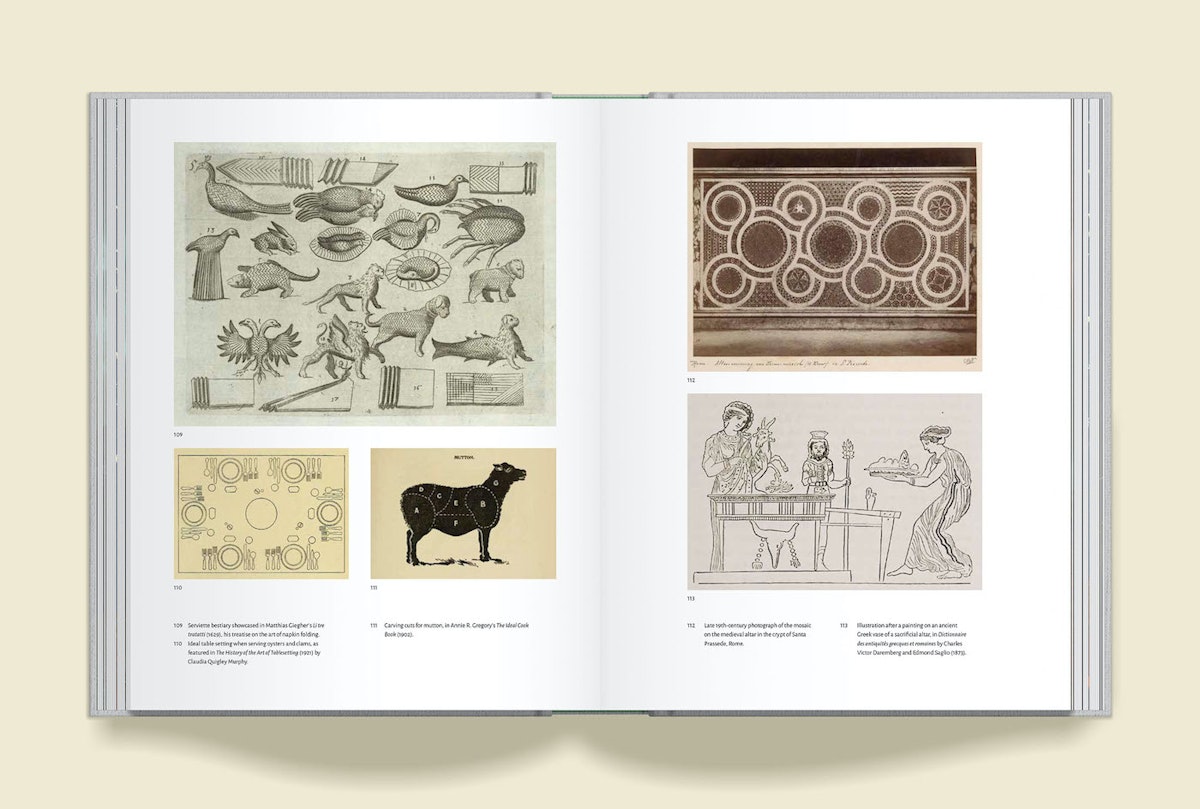
Scroll through the whole page to download all images before printing.It’s not necessarily a case of readers needing to see all these things, like a code to be cracked, but rather about creating a space alive and teeming with such possibilities, a playful and imaginative space into which readers might bring connections I’ve never even considered — new ways of seeing and creating meaning. This can be purely between the images on the page, but also even incorporate things experienced beyond the confines of the page — in the room in which the reader sits, a song playing in the background, a dream they had that morning. The idea is to make these historical images come alive in a new context, tease out connections (both explicit and subterranean) while very much respecting each image's specific historical context (which is often key to the resonance explored) — in this respect, the grouping of images evokes more the tradition of montage than collage. This aspect comes through particularly in the spreads where there’s a constellation of several images across the pages, each playing off the other. Here’s one about parcelling things up: connecting the rituals of dining and ancient sacrifice.
 Scroll through the whole page to download all images before printing.
***
For more info about the book — and to grab your copy — visit the crowdfunding page on the publisher Volume's website. This edition — with a chance to have your name in the book — is available exclusively through the crowdfunder which ends on Friday June 4th, so don't delay if you want a copy!
UPDATE: The crowdfunder is now over, but you can still buy the standard edition of the book on presale over on Volume here.


